
At Kiva we just released the largest, most ambitious redesign and rebrand within the organization’s ten year history. It’s rare to have the opportunity to undertake a holistic redesign in conjunction with rebranding so I feel lucky to have played a major role leading the effort to design a new user experience and craft a new brand.
I’m working on a detailed write up about the design process but I’ll start by sharing the drivers for undertaking the redesign.
Integrate Zip
In 2011, Kiva launched the experimental website KivaZip.org (which leverages direct person-to-person lending vs. the traditional model of relying on intermediary local microfinance partners). The Kiva Zip pilot gained traction of its own, and, to allow for additional growth and operational efficiency, the organization wanted to integrate the two websites.
Redefine Kiva’s brand
Traditionally microfinance loans are a few hundred dollars and are often deployed to small, individual enterprises such as farming or small markets located in developing countries. Over the past 10 years, Kiva has significantly broadened its offering – for example, you can now lend to small U.S. businesses or students seeking loans for tuition. Yet all too often, lenders along with the press, continue to define Kiva as strictly an international development organization focused on traditional microfinance methods.
Improve the user experience, making lending easy and compelling for mass participation
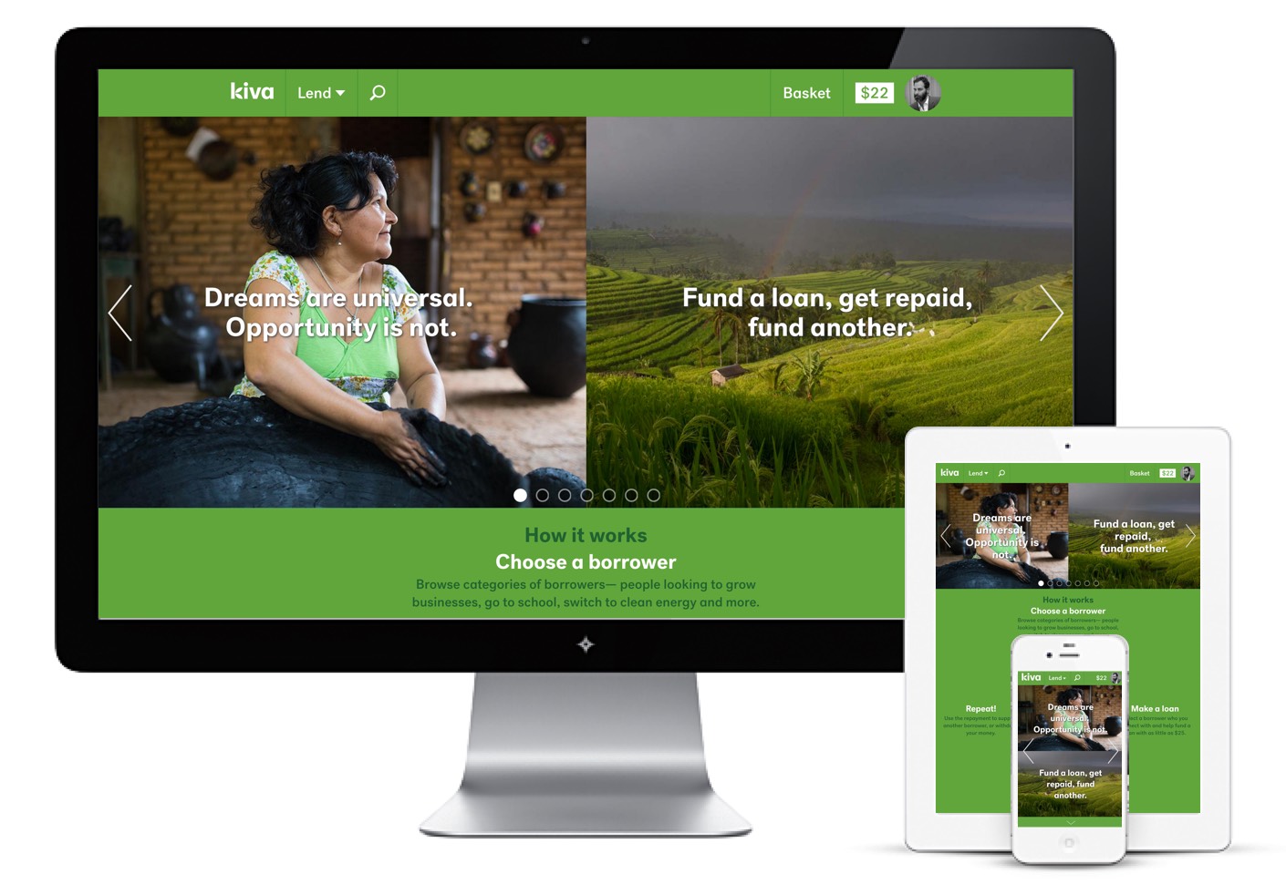
In the six years since the last redesign, the landscape has changed with mobile and tablet usage significantly increasing in popularity: 20% of kiva.org visits come from mobile devices. A redesign provides the opportunity to think holistically about the information architecture, navigation and other key elements of the website – addressing them with a mobile first, responsive design mindset.
This redesign and rebrand was over a year in the making and I’m as proud of this work as anything that came before it. If you have a minute, visit Kiva, I’d love to get your feedback on the redesign. Better yet, if you have $25 make a loan, try it on your phone, it’s easy, I promise.
No comments.